Showing posts with label in progress. Show all posts

Monday, June 21, 2021

Mandatory break

So, I'm pretty sure that anyone who reads this can already tell that I've been on a writing break for a while. It's kind of a huge "duh" at this point. But nonetheless, here I am making the announcement.

I didn't want to go on a break right now, but I didn't have a choice. Between various things in my personal life and the fun stress that comes with them, I was burning out pretty badly. I can tell you from experience that trying to force yourself to keep working on something while burned out is one of the worst mistakes you can make. So rather than ruin a book, I chose to back off for a while. And as it turns out, my brain is slowly beginning to rejuvenate (yay). 

I've had a number of ideas for story concepts, plot fragments, character profiles, and other things like that trickling through my head while on break. Imagine, if you will, the late night scene: We're finally getting to bed after a long day, the lights have been turned off, and then I pop up like a wild woman and grab my phone to make a note before it's gone from my head. I'm sure you can hear my puzzled husband's sleepy questions as to what in the world I'm doing, because we're finally going to bed.

It's not all been for Taloner:Wekthusia; much of it has been for other projects. With that being said, I plan to make time and sit down to go over a few things in the T:W plot and re-work a few details that have been bothering me. I'd like to resume working on this book before the year's out, and while right now it seems like I still have a whole six months to worry about that, that time does tend to disappear quickly. As the manuscript currently sits, I'm roughly 80% of the way through drafting it.

This story has been more challenging than I anticipated it would be, as a couple of the characters have really started feeling like empty cardboard cutouts. And that is something that I do not want. These characters are their own people, with unique personalities and strengths and flaws, and I want to convey that to anyone reading about them in the best way I can. My aim as a writer is very much to help transport you, the reader, into another world that you can experience and enjoy with me. Nobody enjoys staring at a cardboard box. Or reading about one.

As an aside, I'll also try to update this blog a little more, even if there's not much going on with my writing. I'd rather that it not just become a vacant outpost. 

Tuesday, August 28, 2018

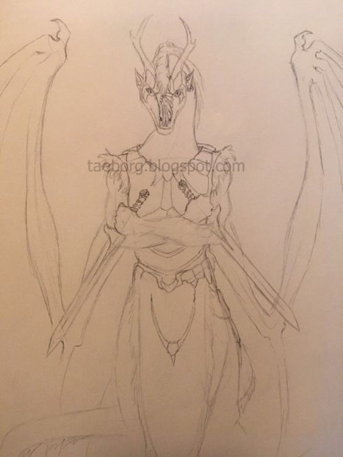
WIP - Himni Rek-Aro


Holy smokes, two posts in one week. What is the world coming to?

I sketched this a couple of weeks ago as part of a small art challenge for myself. This is Himni Rek-Aro, a character who appears in The Rebirth Trilogy. She is the last of the four original original characters I drew when I started writing the trilogy as a teenager, once upon a time (the others being Kuma, Cenme, and Nighteye). I've wanted to draw her for a while in order to more fully flesh out her appearance. This sketch needs a lot of work before I ink it, but it's a start. In particular, I need to redo the details of her mask. The wing theme was okay, but it's not what I wanted. I do plan to ink and color this at some point.

So ... a little trivia for you about Himni, since I've been trying to do this more when I post images of individual characters and such:

The gemstones in Himni's mask are a purple-red sapphire and a red spinel, the latter of which represents "intensity" among the Laiuna people. (Side notes - Different colored sapphires, aside from the familiar blue, may also carry special meaning. And, red spinel is one of my personal favorites when it comes to gemstones)

Himni's home is a city called Juk Sul, which is located in a southern range of Genkian mountains called The Gods' Abode. The city is built at a high elevation, which means that cooler temperatures are a norm, and as such, some of Himni's normal attire includes fur lining. Juk Sul has an interesting history that involves rebelling against the Laiuna empire at one point, and one of the carry-overs of that rebellion is represented by the structure of it's citizens' names; Instead of the traditional name format in the rest of Genkai (Surname, followed by Given Name) the natives of Juk Sul use their Given Name first, followed by their Surname. I won't bore you with further details on all that, but yeah.

Okay, now - Setting aside trivia and sketches, I've also come to a decision: While I still have a number of planned works in store for the Legends of Destiny series, along with a couple other series and projects, no more new projects will be started for the next while .... like, years. I've decided that the amount of back-logged projects I have built up is utterly ridiculous and I'm going to start working through the book titles that have already been announced before I begin anything else. This means that titles such as Sovereign Soul, The Gem Duology, at least some Taloner books will be completed in their first draft form before I move on to anything else. My goal is to drastically cut down on the number of books sitting around in limbo, since some of them were announced a long time ago (cough, Sovereign Soul....)

Oh yeah. I guess that means I'd better make an announcement on which title won out as my current main project, huh? Well, look for that post soon!

Friday, December 2, 2016

This, that, and the other

Good evening,

The second read-through of Wings of Fate is officially finished, and I am now in the process of formatting the manuscript for print. I had about a quarter of it freak out on me last night and convert everything to italics, which meant spending another hour and a half going through and un-italicizing the chapters affected, then hunting through it for all parts that *should* have had italics. Ugh. And last week I lost one of my notebooks that had several maps and pages of notes for future writing projects in it, then found it again several days later. It really was a miracle. The woes of a writer, lol.....

There's one week left until the deadline to get your free eCopy of Wings of Fate! Don't forget to send in a picture of your original copy of the book to cash in on this offer.

Now that I have the manuscript set up, I'll be focusing primarily on finishing the cover art and making sure that any maps being used are ready and inserted into the book. It's crunch time, and it's oh-so-exciting! Here's a sample of what I'm working on:


I have most of the details sketched for the cover, so my next step will be to start laying down the base colors and then proceeding to work on highlights and shadows. I'll also be designing font to use for the title and checking the image parameters against a template for the print size of the cover.

At this point, I'm still tweaking some things in the sketch and finishing with some detail. This has easily been the most challenging cover I've done to date. Hopefully I can wrangle it to look and feel how I want within the next week so that I can upload it and order a proof copy of the book. Wish me luck :/

Tuesday, June 9, 2015

Card Line Art - Batch 1

When you were a kid, did you ever take a super ball and throw it really hard to see how crazy fast it could bounce off of everything? Well, yesterday I was that little ball. My new scanner came! The old one is now so old that it is obsolete, at least with my current laptop (sad day)

With the addition of my new scanner to the family, I can finally upload high quality sketches and line art! Yaaaay!!!!

So, here is the first batch of line art for the trading cards I have been working on. I will be limiting these to groups of twelve or less when uploading, as I tend to get annoyed with photo strips that extend from here to tomorrow. I've been drawing these six to a sheet, so the proportions aren't perfect. That will get addressed after I color the images.

This has been a really good opportunity for me to illustrate some of the concepts from my books. See anything you recognize?

If you have a specific card you would like to see from the series, feel free to say so here! I still have quite a few of these in the works and am terribly excited to get going on coloring them :)


Thursday, May 7, 2015

Feedback Requested!!

Greetings, all. Things have been very busy in my corner of the world. Between lots of work and personal struggles, I have been doing everything I can to complete the revision process for The Rebirth Trilogy.

Cut the chatter, onto the art work! Below is my current WIP for one of the cover pieces I'm working on. I would very much appreciate some feedback on this piece :) The marching figures are indistinct because I turned up the opacity for full so that their color is fully visible. I have been turning opacity of each layer down to around 35% and coloring over the top of the "guide" layer, since just making the guide transparent was a mess. Any odd white/gray patches sticking out are visible portions of the guide layer and will be erased.

What I am looking for: Critique on the lighting of this piece, first and foremost. I am also open to critique on the positioning of figures featured on the cover. Any and all constructive criticism is welcome! If you hate it, I would appreciate it if you tell me why, as that is far more helpful than just saying, "This sucks."

I have uploaded the image in all it's huge glory so that details may be more easily viewed.

Thank you in advance!

Wednesday, April 15, 2015

Accepted cover concept - Path of a Hero

Here's the final cover concept for the redo of the second book in The Rebirth Trilogy - Path of a Hero. This is the copy I will be working off of as I create a digital painting for the cover art.


I would like to have a final product that is of high enough quality for a large digital print I can display on my wall, so it may be some time before this image is finished.

This cover features the character Terezom, the Hero of the god Kem. In the background is an army of mixed creatures, which has to do with a particular scene from the book. Let the coloring begin.

Wednesday, February 25, 2015

Current screenshot - Blayde

In addition to redesigning the covers for my trilogy, I'm brushing up on my painting skills with a program called Krita. My long-faithful tablet finally gave up on me last month, and I've been very fortunate to get a new Wacom Intuous Touch. I figured that it would be a good idea to practice on something before I start designing what will hopefully be high quality cover art.


Here's a shot of my practice project. This is the colored version of a sketch I posted here. This is still very much in progress, as you can see.

Tuesday, July 29, 2014

Cover redo concept sketch


Just a sketch for an idea I'm toying with. I've been wanting to redo the cover for one of my novelettes, Taloner: Reima, for a little while now.

Wednesday, June 25, 2014

Wayside Tales collage

It's time for more art! Today's offerings include a collage I have been working on of recent times. I got the initial inspiration for this piece from this picture. Mine still needs some tweaking on the line art, but I feel like it turned out pretty good.


This features characters or important things that show up in the anthologies I've been working on. I did end up with a little bit of dead space, and I ran out of room at the bottom of the page, which I wasn't thrilled with, but oh well. It's all a learning experience.

Tuesday, April 30, 2013

Trading cards?

Look! Art! Well, sort of. It's a work in progress. This is a fun new project I'm working, not for any special reason except that I want to. Today at work, I was chatting with a friend (S. A. Thorup) and we were postulating on the idea of making trading cards from our books, just for fun. I really liked this idea, so I decided that I will make some of my own cards and see how they turn out. Who knows? Maybe it would be fun to have my own card laminated and on my desk at work :)

Monday, October 31, 2011

The angel: part 2

Still working on this one! Haven't been able to do much with it because of time over the last couple of weeks, but here's my progress as of today.

I thought it might be interesting to put this up at the size that I work at. So be warned if you click the thumbnail, it IS quite large. The canvas size I am using for this one is 2800 pixels across. At this point, I am working on highlighting and smoothing out the hair, after which I'll start filling in more of the base color for the armor. Normally, when I set up my layers, I use separate layers for a basic color, usually a mid-tone, and then I'll do another layer on top of it for the lighting and shadows. This is because when I get to light and shadow, I select the area according to the base color, then switch to the detail layer and lighten or darken that area. Make sense?

Right now, I actually have the layer that has the wing color hidden, just because I'll worry about that more after I've gotten a bunch of the figure's gear and body done. I won't work on the details of the face and skin until then, either. And at some point, I really need to do that background.......

Friday, October 7, 2011

Angel rough thumb

Wow sorry guys, this one is pretty rough, even for a thumbnail. I just don't have the energy to do any more tonight.

I'd like to try a couple of different things style wise as I work on this, one of them being to make it look more like concept art. I've been looking at some stuff lately for video games, all of which reminds me of some of the art I'd seen Alan Lee do for the LotR movies. It's going to be a job, but I think I can pull it off.

Gradients are our friends :)

Friday, September 9, 2011

Happy, happy.........


So while I was inking this, I goofed a bit on the line for the mouth, then realized it actually looked pretty funny. I decided to screenshot it :)

I noticed the other day that I always have the Neth smiling, or at least with a cocky smirk of some kind. One of these days I'll draw one that's angry. No really, I will.

Thursday, June 23, 2011

Meaning...

I wanted to do some writing when I got home from work, but it's been a mighty crappy day with no great prospects, so I decided to draw one of the ideas that's been in my head. There's a story behind this picture, but I'll save that for when I get the completed image up.

At least I hope I get it up. Every time I've tried to draw this figure, I get partway and then fizzle out. Every time.

Monday, May 30, 2011

Behold ...

I've really been hankering to draw something mechanical of late. This image popped into my head tonight, so I did a mad dash to get the concept down before bed time.....I'm a little late to bed, but I think this is a good start, albeit a very sloppy thumbnail, muahaha.

I can tell already that I'm going to have a lot of fun with the lighting on this one. I just have to take it easy and pace myself so I don't kill my hand.

Was listening to a couple of tracks off of the Halo 2 soundtrack while working on some of it, for anyone interested. In particular, "High Charity" from Vol. 1, and the latter half of "Cairo Suite" from Vol. 2 (the sub-tracks are called Jeweled Hull and Chill Exposure, the last being one of my all-time favorite pieces of music)

As always, suggestions or comments are welcome! I'm trying to decide if I want to scale that robot up or down a little, as it seems to be taking up an awkward amount of space in the picture. I'd love to be able to see the entire form of it, but right now it might also seem like "Look, I painted a picture! And then I slapped my android right over the top of it!"

Um yes, that's how it goes in my head, anyway.......

Thursday, April 21, 2011

That thingy again!


So you may remember this. Yes, I got some very helpful pointers on it.......but let's be honest. I was not happy with it. The pose of the creature felt too flat to me, like some giant shoe had come and stomped it into the page.

Yeah. Not what I wanted when I started working on it. But I'm not about to just flush it down the toilet without getting what I want! Hence, this new thumbnail. May I say this is MUCH more what I had in mind. I think I'd like to take it to the next critique group and see what kinds of suggestions I can get from others before moving to the inking stage. Not that I think it's horrible at this stage. Like I said, I am a lot happier with my newest try.

Alright, so I went and found me a nice ref pic of gold, then shrank it down to get a pixel palette out of it. Boy, let me tell you, I was way off on the whole gold thing. I was a little shocked at just how much orange is actually up in your face when viewing gold. It looked too vibrant when I started painting it into this picture, but once I got a few different shades down, I realized just how much better it looked than my previous brassy-hued attempts. Kudos again to Nasan for suggesting that method of picking colors.

Monday, April 4, 2011

What's gray and orange and messy?

Cat fight! Cat fight!..... Sorry, but this part was really fun to write and I'm looking forward to completing the image :)

Progress on a picture that has been sitting in limbo for probably close to half a year now. I initially lost steam for it part way through inking, mostly because I have been battling with the positioning/pose of the far figure and the fire dragon. I went in today and just scrapped both of them, then started anew. Hopefully that helps! The dragon is going to get scaled down so that it's smaller than the figure in the foreground, but I am still playing with both it and the far figure it is charging at.

The green lines going across the picture are some guides I grabbed over at Nasan Hardcastle's blog in order to try them out. It really has been helpful in setting up things in this picture, especially since I had more of an illustration kind of look in mind when I started it.

Thursday, March 31, 2011

Power...

Playing with pose and perspective in this thumbnail. I have to say that I like the pose, but the perspective is a little off. I'm thinking I may have to shift the "floor" a bit further up into the picture to get more of the effect I'm looking for. The race that this creature hails from is known for its arrogance, so I tried giving him a stuck up, disinterested attitude - you know, kind of like when some snot is purposefully ignoring everything you say just to tick you off.

There are a couple of elements here that make this picture different from the other Neth drawings I've been putting up. The differences are turning out to be both fun to work with and challenging, and here's what they are:

First, this guy has actual flames around his hand, rather than an orb of light in his grasp. Second, I'm trying to incorporate something more solid than smoke/mist into his surroundings, which is also different from the other Neth thumbnails I've been doing. Both of these differences are for particular reasons, though I don't think I can really say anything else about them just yet. This character could possibly show up in a project some time in the future, however near or far that may be, and I don't want to spoil things. Sorry!

Monday, March 7, 2011

Shadowed...

I forgot I had this one. Still playing with some things on the lighting, and I was going to put that hand in a different position, but the more I look at it, the more I like it how it is right now.

I could have done green lighting in the middle area or the clouds to help add to the green of the eyes, but I don't want it to look like a Christmas-themed image.....although, that would be kind of a nightmarish Christmas. Eh, sometimes that time of year is like a nightmare for me, I guess. Depends on how much I'm forced to overdose on candy and elves and red-and-green stripes.

Happily, however, this guy is not an elf. Go team villain!