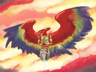
 I might take this to the next critique group. I just can't seem to get those cloud colors bright enough, yet have them dark enough along some spots so that they really contrast with the guy in the middle (admittedly, there's a lot of red, but I think some light/dark adjustments could help) My guess right now is that there's not enough yellows and too much pink. I could possibly stick some dusky purples in there at some points, too.
Mind you, this is a thumbnail, thus the ultra messy quality. Just look at those feathers!
Thoughts, anyone?

One thing you can do is define light and shadow with much more clarity. Your light source seems to be coming from everywhere, so it might be difficult to do this. It appears you have used only a few different shades of shadow (I only see 2-3 darker and lighter shades of the base color on the armor, wings, and scales). Using several different shades of shadow and light on his wings, armor, etc. would help to define him better against the warms of the background. You could also add cool shades to more reflective objects like his armor, the warm colors of his wings, and skin/scales. Sharpening the edges around and on him, even his feathers, would help him to stand out better against the bg as well. For the sword and armor you can give them sharper contrasts of light against shadow to emphasize that they're metal, while the scales and featehrs can have a smoother, more gradient shading if they have a softer look than the metal.
ReplyDeleteFor the bg you could add some shadows to the clouds directly behind him without darkening the character himself, which would help him to stand out. Adding more shadows to the clouds would also help to define the clouds themselves and give it a more realistic effect.
May I suggest putting some sort of defined light source in the background? Putting a light behind him or in some other specific location could allow you to play around even more with shadows, although at the same time it may prove to make it harder to see the character. To me that empty pink spot in the back above his right wing is itching for some company XD That is, unless the whole thing is just supposed to be made of light, then ignore this hehe.
I hope you find my advice useful!
Thank you for the tips!
ReplyDeleteYes, the hard part about this one is that the lighting IS supposed to be coming from everywhere, possibly the character himself (still playing with this) And the other hard part is that much of this is supposed to be made up of warm tones - think of all the hues you see during a vibrant dawn.
I did think about adding some deeper, sharper shadows to points directly under the armor, but I like you idea very much of using softer gradient effects to help draw some focus away from the wings and onto the figure himself. Thanks again! :)
You could also use a reference for macaw wings for his wings, as they bear resemblance to them.
ReplyDeleteHere's some pictures I found that may be useful:
http://4.bp.blogspot.com/_G-EWSfJ1PwE/SmFBj9VJTiI/AAAAAAAAA7o/5WXWfEMk7vE/s320/Parrot_Macaw_frontpicture.jpg
http://www.nwf.org/News-and-Magazines/National-Wildlife/PhotoZone/Archives/2008/~/media/Content/National%20Wildlife%20Magazine%20Layouts/2008/zuckerman_macaw_4909.ashx?w=534&h=437&as=1
http://www.birdsoftt.com/images/scarlet-macaw.jpg
http://2.bp.blogspot.com/_EqQZrgoXvqM/Sjbgu6ZiP2I/AAAAAAAACrw/LvilBsN0OzE/s400/Scarlet+Macaw+pair.jpg
Anywho, hope those are of help!
Oh I changed my screen name - same person! XD
ReplyDeleteHope our comments helped at the critique group!
ReplyDeleteST - Thanks for the references. I'll check them out to try and get a better feel for some color patterns.
ReplyDeleteNasan - You bet they did! That's why I came :)