Thursday, December 23, 2010

Light and Dark


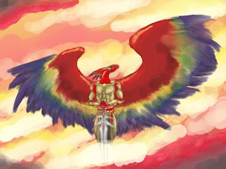
Well, here it is. I tried something a little different with some of the clouds, which turned out to be very helpful. When you select the Smudge tool in Gimp's toolbox, try clicking on the option "Apply Jitter". It's actually nice for blending colors at the same time you smudge.

Ended up moving the head back and shortening the neck just a little bit. It was sticking out far enough that it was bugging me, since these creatures are not supposed to have super long necks, which unfortunately is how I draw them. Talk about a conflicting idea!

I'm not sure if I'm happy with the shine on that sword or not. In hindsight, I think that focusing the bright light more so that it was shining down the center of the blade would have been good, but never mind. I've done enough on this one.

I tried to record most of the coloring process, so I'll see whether or not the software wants to play nice and give me a video to post. No promises :\

Friday, December 17, 2010

Dark...

Another one!

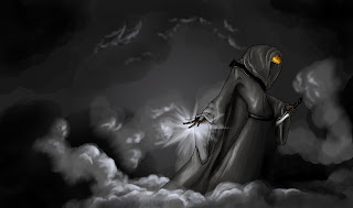
The lighting in this is going to need some more tweaking, as I think it's detracting the focus from the main figure right now. I already adjusted the levels some to help intensify the darkness and focus more of the silver by the hand, but......I'll work on it.

This is another of the anthro newts (or Neth) I'm excited to be working on these, partly because I will be dealing with these guys more in the near future as I write. For anyone wondering, no, this is not Nenenusa from the Rebirth Trilogy. It's an entirely different Neth.

The coloration of this one is based off of the Red-spotted newt (or Eastern newt)

Friday, December 10, 2010

Black, green, and red

Man, I hate days where you're feeling off kilter. Pretty much, I've been a slug today because I've contracted some bug that saps my energy. Wish I could blame being stupid on it, too, since I'm sure there are more productive things I could have done than to draw this :) Whatever, he makes a nice thumbnail. I was trying to do a speed drawing to test out some recording software, but it ended up taking about 2.5 hours.....not so speedy.

Haven't had as much time for drawing this week, since I've been trying to get more writing done. The last month has been woefully lacking for progress in the writing department. Plus, I've been learning to knit, a hobby that's surprisingly fun. See my pretty scarf?

Monday, November 29, 2010

Thumby thumb

I might take this to the next critique group. I just can't seem to get those cloud colors bright enough, yet have them dark enough along some spots so that they really contrast with the guy in the middle (admittedly, there's a lot of red, but I think some light/dark adjustments could help) My guess right now is that there's not enough yellows and too much pink. I could possibly stick some dusky purples in there at some points, too.

Mind you, this is a thumbnail, thus the ultra messy quality. Just look at those feathers!

Thoughts, anyone?

Tuesday, November 23, 2010

Up In Smoke

Got it finished! This one was easy to do and very fun because of the cloudy look. Had a lot of fun with lighting, too.

I used a custom brush to do the majority of the clouds, since the canvas I was working on was 2200x1300 pixels, so you can imagine how small the standard brushes seem at that point. I did use some smudging on the clouds as well, though not as much as I thought I might have to.

Saturday, November 20, 2010

Smoke....

Thumbnail for another project. I do so love the attitude, especially with villains.

If you can't quite tell what you're looking at, this is an anthro newt. The race is one from my books that I absolutely love for the poisonous skin colorations. I am unsure of which species of frog the patterns on this guy are based off of - the picture I was looking at didn't have any info on it.

Some of the lighting is skeewompous, but it's only a rough, after all.

And I won't lie, I did this partly for the background :)

Monday, November 15, 2010

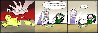
Ever wonder?


I've had this one in my head for a while. Yeah.....that's my sense of humor for you :)

Wednesday, November 10, 2010

No......NO!!


I've been hearing Christmas music recently on the radio.......Now seriously, we're not even halfway through November. Is it such a wonder why I'm depressed that the holidays are coming at the end of each year? I like Christmas and snow and seeing family (and especially New Year's!) but having the holiday shopping craze and jingley music shoved down my throat for nigh two months can be very wearing. Sigh.

Well anyway, this comic marks the digital debut of Devil and Angel, the duo that expresses so many of my thoughts and reactions to situations in life. (Hey, almost sounds like I know what I'm talking about, doesn't it?) I wouldn't mind getting more of them online at some point. Enjoy!

Friday, November 5, 2010

More sketches!

Yay!


Some more creature sketches. I've been trying to pick out ones that might be confusing or detailed to others so that they have something nice to look at. So if you've read any of my stuff and would like to throw in a suggestion on a creature to be drawn, please feel free.

*Professional tour guide voice* On this leg of the tour, you'll see a lovely specimen called a hydra, and beside it is the sultry female lizard man ...... or I guess that would be lizard "woman"............ *no more weird voice*

I'd also like to do the male version of the lizard men, even though I draw them a lot anyway. I also have a few other creatures in mind, but we'll see what I can get done. Sometimes, no matter how much you try to draw them, some subjects just refuse to be drawn.

Monday, November 1, 2010

Gan-Do-Gan sketches/Ouch

Just some rough sketches for one of the more bizarre critters in the books. They're a bird/centaur thing that has been kind of challenging to figure out how they work. For instance, how does enough air get into the lungs of such a creature, seeing as how it has two sets of lungs?? And how does enough blood circulate between the wings, legs, and brain of a creature when it's running or in flight? I'd like to do so me more of these, but I'm going to have to wait until I have more energy.

WARNING!
::RANT TO FOLLOW::

So I didn't have the proper skill to make it into the art challenge at alphabeastiary, apparently. I'll live, but I'm still confused about what desirable points my art is lacking, especially when you look at some of the other pieces that artists have submitted on there and the quality they have. I have to say I feel pretty stung right now, and I'm reminded why I'm not an art major - because I apparently have no clue what people consider good art, seeing as how half the stuff I run across that people applaud and rave about, I'm thinking, "Are you kidding me? I know fourth-graders that could do a better job than that!" or "Well that's just hideous."

Plus, I was encouraged to submit my entry to the DeviantArt group, the one place I will/can never go to again :( :( :( I appreciate that encouragement (and their kind words about my art) but I'm still just feeling very confused and kind of put out now.

Well, whatever, I'll just go cauterize my wounds for a while, I suppose. At least now I have more reason to work on my own creature sketches. And hey, life's not fair, and I can always do the challenge on my own.

Friday, October 29, 2010

Angha/Simurgh

Part of an art challenge going on right now at alphabeastiary, for anyone who wants to check it out. I was curious to see if my art was up to snuff for their standards, so I asked and they told me to send in my art of the first creature for them to judge by, since they weren't sure. This took the better part of my afternoon and I'm not even sure it will make it in, but it will still look nice in the collection.

For anyone who isn't familiar with the angha, or simurgh, it is a mythological animal from Persia that roosts in the Tree of Life and is large enough to eat elephants or whales. It's supposed to be a dog with peacock wings and tail as well as lion's claws. Some of the stuff I read for it on wikipedia noted that a variant on the myth claims that the simurgh had copper feathers, hence my choice of orange (I hope it doesn't look too skewed on bright, warm-toned screens :\ )

Done in Gimp with the good old tablet, and ohhh my poor hand.

Thursday, October 28, 2010

Germosh


Here's a drawing I finished yesterday, and I was so happy to have it done, too. This is supposed to be one of the deities from my books, specifically, the one indirectly responsible for giving wings to giant wolves. I had quite a bit of fun with his patterns and coloration, as I was trying to give him a very distinct, fantastical look (I almost did the brown points in a dark violet blue, but I sure seem to use blue in a lot of things, so I scrapped that idea)

Originally this was a pencil sketch, but I wanted to color it so I ended up inking him. Done in Micron pen and colored pencil, then touched up in Gimp to make it easier on the eyes.


Also for a bit of fun, here's a picture of a couple of jack-o-lanterns I carved last night, since Halloween is almost here.

Tuesday, October 26, 2010

How to waste 5 minutes...

Soooo I wasn't happy with the header I had up for this blog. Can you tell? The black one was just a placeholder, but it was getting on my nerves. I don't think it's far fetched to say that anyone coming to look at my blog would glance at the banner and go, "Hm, another mediochre one. Not impressed."

And I know my art isn't the utmost, jaw-droppingly fantastic stuff out there, but I like to think I'm NOT mediochre. But when your advertising looks that way, why in the world would anyone want to have you create artwork for them? So anyway, the new banner is somewhat better at least. :|

Went to the art critique group again tonight and got some helpful pointers on human composition, which I must try. Ever wondered why I draw a bunch of dragons and beasties? C'mere, it's a secret..............It's because I can't draw the flaming HUMANS like I want! Someday I'll be better. Someday the peoples in my brain will come out on paper the way I want........Someday I'll go sit somewhere in public and weird people out while I sketch rough references for size and anatomy, muahaha.

Also I've been trying to figure out a way to get word around a little more that I'm actually accepting commissions. I think two out of the three people who know about it have forgotten :\ And I'm leery of places like dA, FA, or epilogue.net because of bad experiences and the kind of content one can find on there. Seriously, it's great that people can draw anatomy of humans or anthro's so well, but I don't want to see quite as much of the detail as they tend to put into it. Like the risque, jiggly kinds. If you catch my drift. In other words, this means I'm marooned on my own island of blogland, which is not to belittle the couple of friends who actually read this blog. You guys are awesome and you make me feel loved and warm and fuzzy!

I've been wanting to do more art since going to the critique group in the summer, but part of my problem is that I get horrible eyestrain or handstrain, so I've had to back off of things for a while. I never thought I'd be much into the critiquing (sp?) but just being able to see other peoples' styles, sketches, completed art and receiving advice from those people does wonders for motivation. I think I also have a lot of that thing going on, you know, the thing? What I mean is where you become so used to what you can do that you feel like everyone must be able to do that, then you see what others are capable of (in this case, their art) and you feel like you're pretty bad. I'm working on it, as I very much like my own art, but sometimes I really feel like others have an established, professional style, and mine is pretty wibbly and immature.

Well I have to say, I do feel a little better for having gotten all that off my chest. Now for bed........
Friday, October 15, 2010

Bleh

The latest distraction. Uber fire color fail - mayhaps I need to study some fire references :/ Why must you elude me, fire, WHY?!?!?!

This is just a thumbnail of a rough sketch, so that's why it looks crappy. Two hours down the drain.....I am so stupid for staying up this late. I'm going to BED.

Friday, October 1, 2010

projects...

Just a little something I'm working on. I had finished this image several months ago, then decided that I wasn't happy with some of the lighting. I've been meaning to get to it for a while and today I finally did. I have to say, I'm having a lot of fun with it, now that I know a few new tricks to try :)

The top screenshot is of the version I'm currently working with. The bottom one is what the former coloring looked like with the intended background. See how the lighting on the gray wyvern just isn't working that well? It looks like he got kool-aid or something splashed on him.

The entire image will be used as a book cover for my current writing project, so I want it to be as spiffy as it can. And let me tell you, I lurvs the dark lighting with bright splashes of color!

Monday, September 27, 2010

Ph34r the pink!!!


Just a silly doodle I did today. I found myself sitting there, saying to myself, "Self - draw me a cool pink dragon!"

to which I said, "Okay!"

Monday, September 20, 2010

Tsag Reference

(EDIT: Okay, the first one was bugging me enough that I went back and cropped out some parts so that it was cleaner and hopefully makes more sense! It's at the bottom)

Wow, my hand hurts. This took forever to complete, though I did get to tinker with a few design elements to see what I liked best. Still, I'm wondering now if I might have to adjust the price I'd ask for these, should I ever get commissioned to set one up (I was going to charge $20, but based on the time and work that went into this, I'm thinking that $25 might be more accurate. Thoughts, anyone?)

So I got to play with some of the different options for viewing layers (overlay, multiply) And I also got this guy drawn in his full armor uniform. He's one of the characters from my trilogy and I like his coloration. Up until now, I've only ever had one bust shot of him drawn, and that's at a few years old, so I wanted something updated. Had a lot of fun with the armor, wish I could have drawn his big lance as well, but it wouldn't have fit very nicely on the sheet.

Oh, that top right corner is woefully empty! In my defence, there really wasn't much on him that I wanted to reference.

This one was a test run to see how I could set up reference sheets. I figured that if I had something to present to people as a sample, it might help garner some interest, instead of this happening:

me - "Hey, I can draw those! They're fun."
interested person - "Oh? Can I see some of your past work?"
me - "Um, I don't have any.....but I know it would look good!"
now disinterested person - "I see."

Monday, September 13, 2010

Bird sorcerer

Can I just say how proud I am of this one? Not only did I have a lot of fun with the lighting, but this is the first decent raptor head I've been able to draw without using a reference. Yay!

Was headed to bed the other night and this guy walked in around midnight, so I did a quick base sketch because I liked the idea of the pose and everything....and yeah, I'm sure you get it. Drawn with a .7 mech pencil and a 4B graphite pencil for the darker areas. You can probably see that the scanner left that lovely dark strip along the left side there.....it was not my doing :)

Saturday, September 4, 2010

6/7: Day 3

Third round of sketching, and I'm disappointed to say that I think I'm going to have to put the project on hold for a little bit, due to eyestrain problems.

I think this one turned out well, though I probably could have done more with the detail of the wings and their shadowing. The scales were kind of a pain in the butt, but at least there weren't a ton of them.

Friday, September 3, 2010

6/7: Day 2

More sketches. Had quite a bit of fun with the ninja outfit :)

Thursday, September 2, 2010

6/7: Day 1

Here's the beginnings of a new little project I'll be working on over the next week. One sketch a day for six days out of seven, which gives me an application for drawing a bunch of random things. Hopefully, it will give me some good portfolio material, too, but in the meantime I'm just going to have fun.

Done completely in .7 mechanical pencil.

Saturday, August 28, 2010

Con badge

I never go to conventions, but I've seen some cool badges on the web lately and decided that I wanted one for myself. So, I sat down and did this one. Not too bad, considering it's my first one, eh? I'm really happy with how it turned out. I might get it laminated to help protect it.

The artwork was done on white computer paper with micron pen, graphite and colored pencils. After that I just cut it out (the worst phase, imo) and glued it to some cardstock.

The character here is my persona, of course. It's a cyborg-ish anthro dragon. I usually have trouble drawing this character and getting it to look right, as the dragon is long, lean, limber, and has a dash of attitude. I usually can't get the proportions estimated correctly when I start drawing it, which is what throws me off. I think I got it this time, though :)

I'd definately be up for doing more of these in the future, though I don't actually know any con-goers so it might be a while before I get the chance.

Monday, August 23, 2010

Holy handcramp, Batman!

I get back from a lovely week of being away from electronic headaches, and what do I do? I go and give myself an awful arm and hand cramp with a side of headache. Sometimes I hate technology.

Background was done in a rapid combination of the path tool, Iwarp and blur filters. I also experimented with a different technique for the inking, which I think I like - I tried to do more of a calligraphy/inked -esque style, kind of something uneven and wiggly. Drew this on a random impulse to contribute to a wiki and was hoping it would be a speed drawing, but thanks to those feathers it ended up taking three hours. Pooh :|

This wyvern belongs to my cousin, not moi.

Wednesday, August 4, 2010

Biffed it

He missed :)

I hope you enjoy this image as much as I have/am. It makes me giggle, which is good for the heart. I had some fun with the dodge/burn tool on here. Took maybe a couple of hours, give or take a little, from sketch to ink to color, yaaay.

Thursday, July 22, 2010

The Ice Pixy

Incredibly fun piccy to do! Sorry, Julie, I hope you don't mind.

I came home from work today wanting to draw something and started a base sketch for something else, then started this and threw the other one away. Seeing as how I draw dragons/reptiles most often, I wanted to get a little break from the less-than-pretty things. I'm surprised at how fast I ended up getting this one done (about a few hours, give or take) Some pictures can take me a couple of days to complete, depending on the detail.

I got to do something with this drawing that I have been wanting to try for a long time: inking with a color other than black. I very much want to use this technique again. Other than that the color was pretty straightforward. I used the path tool to select the wings and used the gradiant tool (foreground color to transparent) The glow was achieved by using the Neon effect under the Filters>Alpha to Logo tabs, and for the sparklies I used the Sparks brush.

This character/persona belongs to TheIcePixy (aka Julie), NOT me.

Wednesday, July 21, 2010

archaeopteryx thingy

The coolest chicken evar. I needed something fun and quick to slap onto my commission info for if/when it ever gets set up, and he got the job. With this, I wanted to show off some of my skills, including something that was NOT a dragon, so please don't confuse him for one. He's a dinosaur.

Wait. Chicken. Male. Does not compute. Error, err-

This guy started out forest green with banana yellow, orange, red and turquoise wings. It was a combo that had me making this face :\ So thanks to the colorize option under the Color tab, I was able to fix that problem by turning his green to that nice maroon shade and the yellow to purple. Much easier to swallow. I also used the smudge feature fairly heavily in here to get the blending effect on the feathers and smooth out some of the deep shades of the skin. I opted not to mess too much with the lighting and shadowing, since I kind of like the flat color look for this. That's my excuse anyway.

Friday, July 16, 2010

Griselda

So I wanted to do this image partly to play with clouds. They turned out alright, but I need to work on some of my lighting.

I had a lot of fun here, especially because this was a good learning opportunity for me with different brush dynamics and line weights. I also discovered that coloring something that's white is more fun than I thought it would be. I like being able to incorporate so much color and still have it look good. The shadowing was a little difficult, but after convincing myself that it was okay to press harder with my tablet pen and get a darker shade, I think it came out good.

This character belongs to Sarah Thorup and is posted here with her permission. The blue scale detail is supposed to go across all of the white on her, but I was worried that trying to do that would make it look messy at the size I drew it, so I opted to do a partial thing where the blue would only be shown off at certain angles, kind of like a pearlescent effect.

Monday, July 12, 2010

EE cover original

The uncut image for the third book in the trilogy, Eternity's Edge. I was really pleased with how the color came out on this one, though I did have some difficulty in getting the wings to look right. I tried mirroring them and then didn't like how it looked, so I ended up altering different parts on each wing to try and may them look more individualistic.

This image is of the character Aphral. It may be a little harder to tell, but the view is actually of his back and the top of his head. The spot of color on the head was intended to be an opal, not an eye, and after some tinkering with the color, I had to select an oval region and fill it with a supernova effect. Originally, I had intended to leave the oval spot open in the white so that there was a hole - the center of the supernova in the background would have shown through and looked like the opal. It didn't quite work out that way, so I ended up doing two supernova's: one on the head and one in the background. Over all though, I think this one turned out like I wanted, particularly with the blur.

Friday, July 9, 2010

PoaH cover original

This is the uncut image I created for the second book in the Rebirth Trilogy, Path of a Hero. Same story here for starting as it was with the WoF cover: I did a sketch on paper and transfered it to the computer, then used the path tool in GIMP to go around and fill in portions with gray. I stuck with the same concept I used for the first cover, which was duplicating the layer twice and altering the color of layers 2 and 3, then using the blur feature and adding lighting effects.

Something I did differently here was to add an additional layer of colored detail (the green and silver swirls on the wings and body), something I did not do with the other two covers. I liked the figure very much in this image but the detail didn't seem nearly as snazzy as the first cover image, so I was trying to help spice it up. It didn't come out quite like I'd pictured it, but I still think it was alright. Unfortunately, the best parts of the detail, in my opinion, ended up getting sacrificed when it came time to crop the image down for the cover template.

This image is intended to be of the character Terezom, hence the gray color and robe. The ball of green light in his hand is supposed to look like a magic spell, which might be obvious. The theme I decided on for each of the three covers was the three Heroes; the cover of each book features the respective Hero that is introduced at that point in the story. I liked this theme and it worked out well for both the story and cover designs, as it gave me something to help bind the art of the three together so that they were more relevant to each other. I also enjoyed developing this style of art, even though it takes a while to complete with eyestrain involved. It allowed me a lot of space to play with the flow of lines in a 2D kind of way.

Thursday, July 8, 2010

WoF cover original

I figured that to get things started with, I'd begin with something fun. This is a larger version of the image found on the front cover of Wings of Fate. I somehow didn't manage to save the entire image in its non-text form, but I did manage to retain this one. At some point I might like to go back and attempt to re-create the effects of color and detail seen in this one, as I still have the raw digital file for this (ie, the one without all the cool lighting and blurring effects)

What I did for this style of art was to first do a crude sketch on paper to get the gist of flow and form needed for the body, then scanned it in and went around using the path tool in GIMP (aka the pen tool in Photoshop) to select large portions and fill them in with a base color. After that I duplicated the layer twice and altered the color of each. I believe the colors I used for layers 2 and 3 were sky blue and black, since they contrasted nicely with the original navy blue. These two were then merged together and blurred using motion blur. The gold sun spot in the corner was easy, as it was one of the Gflares available as a default. The background of the image was done using the lighting effects option, and I really hope I can replicate this if I go back and redo this image to get the complete thing again. Did that make any sense??

This particular image took a murderously long time to do, mostly because I was still new to the idea of using multiple layers and hadn't learned how to group things yet, as well as the fact that I was being super detailed with the path tool. I think I had it zoomed up to 200 or 400 percent for the majority of the time I was working on it. Still, I have to admit that the final result was extremely satisfactory and I love looking at this image. It is intended to be a semblance of the character Kuma with his spirit flames moving around him, though in this image his eyes are white, not the customary red. I did this to help it better blend with the background and try to give it something of an ethereal look.

Edit: Rough sketch added for reference :)