Wednesday, November 16, 2011

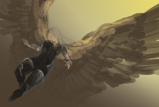
Timewarp: Hawk


Since I'm taking a break from drawing for a while, I figured I would put up some old art lovin's. This is a traditional piece I did back in 2008 that was very fun, but oh so detailed. I love drawing machines - at least, when I don't run out of energy before I'm even halfway through with them.

Done in micron pen, watercolor pencil, and silver colored pencil.

Monday, November 7, 2011

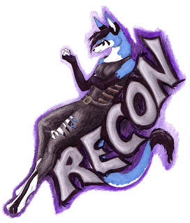
Recon + A little request


Trade piece done for theNightFell of her character, Recon. I had a lot of fun with inks on here, since this gave me the excuse to go and purchase my first ever art marker, yahoo! I also used my black brush pen generously......oh, it will be a sad, sad day when that thing dies. Anyhow, it was mentioned that the character might fit the whole post-apocalyptic look. I will admit now that I had to look it up to see just what kind of style that was. I guess I didn't realize that Terminator could be considered part of that bracket, but it makes sense now.

Recon belongs to theNightFell. Remember children, no stealing! You don't want to make me release the ninjas.

Alright, I now have a question for you artsy people. Yes, I'm looking at you. When you are suffering from a lack of artistic inspiration, what do you do? What helps get your juices flowing again? Suffice it to say that I have been dealing with a great amount of stress lately, and it has been doing a good job of killing my muse. I am usually inspired by the beauty of the outdoors, by good music, by the random things I see like striking swatches of color or fun geometric designs. I still notice those things, but somehow they haven't been translating to the energy to draw. It could be that I've been overdoing things for a while and am suffering from prolonged burnout, but I thought I'd see what other folks do when they hit a road block like this.

Monday, October 31, 2011

The angel: part 2

Still working on this one! Haven't been able to do much with it because of time over the last couple of weeks, but here's my progress as of today.

I thought it might be interesting to put this up at the size that I work at. So be warned if you click the thumbnail, it IS quite large. The canvas size I am using for this one is 2800 pixels across. At this point, I am working on highlighting and smoothing out the hair, after which I'll start filling in more of the base color for the armor. Normally, when I set up my layers, I use separate layers for a basic color, usually a mid-tone, and then I'll do another layer on top of it for the lighting and shadows. This is because when I get to light and shadow, I select the area according to the base color, then switch to the detail layer and lighten or darken that area. Make sense?

Right now, I actually have the layer that has the wing color hidden, just because I'll worry about that more after I've gotten a bunch of the figure's gear and body done. I won't work on the details of the face and skin until then, either. And at some point, I really need to do that background.......

Monday, October 24, 2011

You dirty --

If I ever meet Cupid, I'm gonna punch him in the mouth .......... or .... something.

Just venting a bit. I've been feeling pretty upset about certain aspects of Life lately. Can you guess what they are?

Like really upset.

Friday, October 14, 2011

Featherbrained

A few weeks ago, I got bit by the urge to start making things with feathers - jewelry, specifically. Thus far, I've made several pairs of earrings, though I do have some other crafting projects in the works. The middle picture is of a pair I made for myself!


I've gotten a little carried away with all of this stuff. I think this last picture speaks for itself:


In my defense, one of those totes belongs to my mom.....the smallest one. All the rest of the mess is mine, and the feathers I have consist both of some that have been purchased and some that I've picked up while out adventuring. I have a couple of the latter that I'm still trying to identify a species on. At first I thought they might be hawk, but now I'm leaning more toward turkey vulture. Exciting stuff for a nut like me!

Monday, October 10, 2011

What I see

Want to know something? Some of my scariest dreams involve sea creatures. This is the best I could do of a part of what I saw in a dream last night. These are mostly prehistoric sea things, so far as I can tell. I would paint up some pictures of the more detailed things, if I could do them justice.

Last night, I saw things like biomechanical octopi that could use short bursts of magnetic forcefields to grab prey. Other times, I have seen some of the scariest, darkest waters you can imagine with creatures to match them. I'll see fish, eels, and monsters who are slimy and deformed. They'll be impossibly huge with glowing points or bristle with teeth, fins, and spines. And often times, I'll feel as if they're sucking me toward them and I have to vacate the area very quickly.

I'm not sure why I have fish in my nightmares. I was never scarred by sea creatures as a child. I never watched the movie Jaws, and I never had a tragic incident with pet fish. But it never fails that if I see murky water choked with algae or shadows in a dream, I feel very inspired to run.

Friday, October 7, 2011

Angel rough thumb

Wow sorry guys, this one is pretty rough, even for a thumbnail. I just don't have the energy to do any more tonight.

I'd like to try a couple of different things style wise as I work on this, one of them being to make it look more like concept art. I've been looking at some stuff lately for video games, all of which reminds me of some of the art I'd seen Alan Lee do for the LotR movies. It's going to be a job, but I think I can pull it off.

Gradients are our friends :)

Tuesday, September 27, 2011

Details, details


Workin' hard or hardly workin'. That seems to be me lately. Due to some personal issues I've been dealing with, I haven't gotten nearly as much art up this month as I'd have liked to. I'm hoping the next few months will be a little more productive.

Whew, this one took a lot of time! I was trying to pick things that I could put on this sheet that would be helpful, not pointless. I ended up cutting out some stuff due to crowding and relevance. I'm particularly happy with that aerial view, and I had fun playing with some background effects, even though they were relatively simple (the background shouldn't detract from the main image, right?)

And yes, I'm sorry, it's my avatar. Again. I have no life, what do you expect?

Note to self: Any image with 25+ layers and a size exceeding 3000 pixels is probably pushing my computer's tolerance levels.

Good night.

Friday, September 16, 2011

The End-all Argument


Is to simply wipe out the other side, of course.

Meet another villain from my current writing project. His pose still looks kind of funny to me, but I changed it a couple of times and at least it looks better than it did before. Even if I keep seeing him and thinking he must be going, "Doooo dooo, doot-dee-doot-doot-doo! :D" Sigh....

While I don't feel this is my best piece to date, I am very happy with it because it turned out to be a good learning piece for lighting across moving clothes and terrain. I also got to play around with how the moon would look (yes, it really is blue in the series) as well as things like clouds and smoke at night. I was losing steam for this image about halfway through, then kicked myself in the butt and kept working on it throughout the week. I'm happy I did.

And of course, comments and thoughts are always welcome!

Friday, September 9, 2011

Happy, happy.........


So while I was inking this, I goofed a bit on the line for the mouth, then realized it actually looked pretty funny. I decided to screenshot it :)

I noticed the other day that I always have the Neth smiling, or at least with a cocky smirk of some kind. One of these days I'll draw one that's angry. No really, I will.

Saturday, August 27, 2011

Badge Collage

Oh, you thought I was kidding when I said I must be crazy? Hmmm nope, afraid not.

Here's some of what I've been up to for the last seven months or so. There exists a fandom of the anthropomorphic art of animals, the fans of which are collectively known as "furries" (because their individual characters are usually fur-bearing animals of some kind). I don't consider myself a furry, but I've been participating in the monthly trade community I found on Livejournal, which is where members are randomly matched up with each other to draw name badges of each others' characters. It's been nice to be able to trade art with some other people, since it's hard for me to find an art community I like and stay there for a while.

Most of these were done in micron pen, brush pen, colored pencil and a little gel pen, though one was done digitally.

Characters are copyright their respective owners.

Tuesday, August 16, 2011

Loddie

I must be nuts, because I keep jumping on the bandwagon to draw stuff for other people. It's fun, but it does tend to wear me out and sometimes I need steam for other projects. I would say it's also hurting my chances at commissions........but lately I've been taking a good look at my art, and it seems a little more, um, childish than I'd like.

Despite that, I think this piece came out pretty good. I was so proud of myself for going around on the dragon's body and doing all these lovely touches of fur, and then I decided I wanted to do something with nighttime lighting. And that meant nuking most all of the lighting I'd done on the body. Bah.......

Character belongs to Orangedragoness.

Monday, August 8, 2011

Friday, August 5, 2011

Color me!

So I'm sick right now, and it's a bummer. Want to help cheer me up? Color this picture however you want and then let me know what you did! I just ask that you please do not modify the original line art, and please credit me as the original artist if you post your results anywhere. Have at it!

Monday, August 1, 2011

Elechi phoenix form

This is one of the deities from my book series. She normally appears as a powdery blue phoenix who serves as the handmaiden to a more powerful goddess of healing and knowledge. I thought the element of the phoenix and it's rebirth cycle went well with the whole theme of healing ...... though I'm a little fond of the phoenix, anyway :)

The quality of this one is a little patchy, since the sketchbook I drew it in does not sit on the scanner very well. I had to take a picture with my camera instead.

Done in micron pen and some colored pencil.

Thursday, July 28, 2011

Actually, it's not my favorite color...

You know, because of the colors I'd used for my online avatar, I think I've given people the wrong idea that my favorite color is green. It's not, actually. I have three favorite colors, in fact, and they're all present in this picture. Can you guess what they are?

So if green isn't my favorite color, then why did I use it for my avatar? Well, why not? When I came up with the dragon character, I wanted it to be all black. And glowing green looks cool against black. It's as simple as that :)

Had some fun with the Neon effect here. I think it's been one of my favorite filter effects on Gimp since I ran across it, partly because it gives such a nice touch to glowing components and partly because I'm lazy. Hey, if the tool is there, use it!

P.S. And my character's markings are still green :) I just decided to play with a touch of Tron stuff here.

Tuesday, July 26, 2011

Cloud speed paint 2


Another one, this time based on what the sky outside actually looked like at the time. It's been raining off and on today, and rainclouds always make for a nice sunset, in my opinion. I glanced up at the sky, thought, "Hey, I can paint that!" then grabbed my laptop and tablet and hauled fanny to the back porch to sit down and paint. It's not as great as what the sky actually looked like, but this is the first time I've attempted to sit down and hurry and sketch something I'm looking at with my tablet.

I really enjoy sketching things quickly like this before they're gone. I've done some pencil sketches of both cats and people, neither one of which is inclined to sit still for very long, but there's always a thrill when you successfully get something down on paper before it moves ..... or on screen, in this case.

I think even a year ago, I would have felt strained if I were to attempt an exercise like this. It's been enjoyable (and encouraging!) to see how much I've been able to grow in my art in the last several years. Even in highschool, my range of what I was comfortable with drawing and what I was capable of drawing was fairly limited. It probably helps that I've felt more enthusiastic lately to try different techniques and challenges.

Wednesday, July 20, 2011

White pencil play


I'm a scavenger. I admit it. This is the leftover cardboard backing from a ream of timesheets that got used up at work. I wanted to try doing something that was just ink and white colored pencil on brown "paper", since I've been seeing a lot of that kind of thing lately and it really interests me.

So all in all, this was pretty fun! This is the first time I've tried this coloring style of art. Acrocanthosaurus and Stegosaurus were my specimens of choice here, and while I'm pretty sure I did a couple horrible versions of stego's when I was a kid, this is my first time trying an Acro :)

Rather than try to look off of someone else's interpretation of certain dinosaurs when I'm trying to draw them, I've instead been looking up skeletons and then sketching out my own interpretation of the dinosaur. I really like doing this, not only because it's fun to watch the dinosaur kind of flesh out as I draw it, but it's so much easier for me to go off of a skeleton and have that base to build on, whereas if I tried to look at a full-bodied dino and draw it, I suffer from no end of confusion anatomy-wise. It must be the whole shapes/skeletons-are-your-friends thing. I'm glad I've finally become more comfortable with using them.

Monday, July 11, 2011

Gerine Dinofied


Done as a commission for v-e-r-a. I put up a little add offering to create custom dinosaurs for people on Livejournal, and she asked to have her tangerine albino iguana drawn as an Amargasaurus, a species I haven't had the pleasure of drawing before this. I enjoyed the bright colors of the character quite a bit, and I hope to be able to do more things like this in the future.

Done in micron pen and colored pencil. Character belongs to v-e-r-a.

Friday, July 8, 2011

Rilus


This was done as a birthday present for Djinni (Tod Wills) over on Livejournal. The character is from an online comic he has, which you can find here.

Done in micron and archival pens with some colored pencil for good measure. Rilus belongs to Tod Wills - no stealie!

Friday, July 1, 2011

At the Heart of the Matter


You know it wouldn't be a Friday night unless I wasted three hours of good sleeping time on art........And thank you to everyone who helped me on this by giving your comments and opinions!

Here's another of the projects that have been sitting on my to-do list; hooray for knocking another one down! I think I could have done much better on the lighting of the wings, but I was getting overwhelmed with the different tones. I'm more accustomed to working with silver-colored metals when I do shiny things like this, and you wouldn't think it's that much of an adjustment to transition between gold and silver, but for me it's been hard. I think the cooler colors are more comfortable for my eyes.

These creatures are a special creature I designed for a scene toward the end of The Rebirth Trilogy. They are not, in fact, dragons. They're a mythical guardian beast called Xhuahan (pronounced SHOO-uh-han) The gist of it is that they are the servants of one of the goddesses, and while the ones here are golden statues, they've uh, animated on the three little travelers in their realm. Nothing like fighting a massive wall of metal to round out your quest!

The Xhuahan are supposed to have the body of a lioness, tail of a crocodile, wings of a raven, neck of an eagle, horns of a rhinoceros, and an indistinct head vaguely similar to a brown bear's.

Tuesday, June 28, 2011

Killing Time

Some stress relief art. I have been going crazy lately from work related things. I've also been struggling with some personal frustrations, but I don't feel like this is the place to elaborate on them. Just say that I find myself needing to do something, but I can't do anything, so I sit down and try to draw a random picture - and tonight it worked!

I would like some honest opinions about something, please. While drawing this, I tried to make the chest and torso area a little bigger than I usually would. I really enjoy drawing the musculature of male physiques, but I tend to draw them in a very thin, wiry way because whenever I try to draw something with a big chest (think "barrel chested"), to me it looks like a person on steroids. So I would like to hear any opinions on the chest size in this image. Does it look a little small to you? Kind of big? Does it look okay? Any reasons you'd like to share why? I'm fine with this figure, as the character is somewhat more of a lean character, but he's also supposed to have a warrior's build to him. So I dunno.....the floor is open to debate.

Oh by the way, meet Krieg, everyone. He shows up in my next writing project, which I'll be working on after I finish Nethbane. I won't say much about him beyond that, but I enjoy his character so you may see him popping up again.

Thursday, June 23, 2011

Meaning...

I wanted to do some writing when I got home from work, but it's been a mighty crappy day with no great prospects, so I decided to draw one of the ideas that's been in my head. There's a story behind this picture, but I'll save that for when I get the completed image up.

At least I hope I get it up. Every time I've tried to draw this figure, I get partway and then fizzle out. Every time.

Wednesday, June 22, 2011

Fun with markers

I purchased a few new markers to play with and needed something to color, so I drew myself a couple of dinosaurs. I don't think I did too badly for not using any visual references, though that Hadrosaur ended up being more cutesy than the red guy.

As fun as these were, I found out that not one, but TWO of the tips of my new markers are pretty dry. The gray one I got seems to be pretty good, though. Maybe at some point in the future I'll get some more of that brand, methinks.

Monday, June 20, 2011

Amanagir Sketches

So I was naughty in church yesterday and took to sketching a few things on the back of my program.......don't judge me.

This is some play at head views of Amanagir, which are the lizard men from my series. The one exception is the guy at the top, who's actually a Neth (newt person) They were done in ballpoint pen, since I don't every have more than a pen and a red pencil in my scripture case.

Monday, June 13, 2011

Celure vs Sahamel


SPOILER ALERT! Look away before you ruin the experience! Your eyes will melt and your pants will catch on fire!! ....... Oh well, I tried.

I got it done! Ha HA, you nasty picture, how you like THEM apples??? Ohhh it has been a long and difficult battle to get this image completed. I'll probably come back and touch it up when I have more time tomorrow, but for now it's getting put up for your viewing pleasure. I needed a victory tonight.

This is a scene from Taloner: Reima, one of the short stories I have written and self-published (shameless promotion! Yay!) I really, really enjoyed writing this scene, which is a magic-heavy duel between a priestess and a sorceress, and ever since writing that book I've had this image in my head. I would love to use it as some kind of cover image if I ever release a special edition of some of the Taloner books. (Yep, there will be more of them.....I told you this was rife with spoilers)

So I had a lot of stuff on this that wanted to fight me from the get-go. First off, I don't know how many times I've had to rehash the positioning of the figures here. I also couldn't tell you how much time was spent working with that fire dragon to get it into a shape/spot that I felt was at least workable, and not an eyesore (I really hope it isn't still an eyesore) Another thing I had a problem with was that I am still learning how to draw humans well enough that I don't make a laughing stock of my art. That elf's face was incredibly challenging for me to get right, but I think this is the best result that the (far too many) hours have yielded, and I'm pretty happy with it.

I used my method of erasing out portions of a solid black layer on this to get most of the shadows. I wanted it to have a more dramatic look with the dark against the colors, and I love this method because it's like forcing your brain to work in reverse when coloring.

For example - When not using the blackdrop layer method for shadows, I begin the coloring stage by putting down chunks of a medium-toned flat color. After this I proceed to go in and color darker or lighter portions along that flat color in order to give the original tone some variation. With the blackdrop layer approach, I do the flat colors, then the highlights or lighter tones, then drop the black over everything and go in to erase the spots I don't want to be so shadowed, such as the highlighted portions and a little of the original flat color. I hope you understand what I just said. It makes sense in my head, at least. Sigh........

Monday, May 30, 2011

Behold ...

I've really been hankering to draw something mechanical of late. This image popped into my head tonight, so I did a mad dash to get the concept down before bed time.....I'm a little late to bed, but I think this is a good start, albeit a very sloppy thumbnail, muahaha.

I can tell already that I'm going to have a lot of fun with the lighting on this one. I just have to take it easy and pace myself so I don't kill my hand.

Was listening to a couple of tracks off of the Halo 2 soundtrack while working on some of it, for anyone interested. In particular, "High Charity" from Vol. 1, and the latter half of "Cairo Suite" from Vol. 2 (the sub-tracks are called Jeweled Hull and Chill Exposure, the last being one of my all-time favorite pieces of music)

As always, suggestions or comments are welcome! I'm trying to decide if I want to scale that robot up or down a little, as it seems to be taking up an awkward amount of space in the picture. I'd love to be able to see the entire form of it, but right now it might also seem like "Look, I painted a picture! And then I slapped my android right over the top of it!"

Um yes, that's how it goes in my head, anyway.......

Thursday, May 26, 2011

Wandering in Green


Xenithar is so good to me. She agreed to do yet another art trade when I came and asked, and she's put up with me plenty of times before. This is easily the most extravagant trade piece I've ever done, and I think I'm done doing them for a while. (I need to focus on other things)

So I started in on this piece by battling with the original pose I had of the character. I was also having a problem with the terrain, which is meant to be somewhere in a jungle. It was pretty much too flat for my liking, and the angle of the character kept bothering me. I got through the inks and started on the coloring .... then decided to scrap the whole thing and start over. I'm very happy I did this. I was so much more comfortable working on this during round two than I was with the first try.

I very much enjoyed the coloration of the character, and I also had quite a bit of fun with the lighting here. This is the first time I've tried to do some kind of light beam, and while I have room to improve, I don't think I did too badly for an initial attempt. What I did was to select a region with the Free Select tool and filled it with a gradient (foreground to transparent, specifically) then selected a smaller region inside of that and did a second gradient of a lighter shade. After that I cut out some shafts where the character was blocking the light, then played around with some motion blurring. I found out you have to be careful if you use this method for a light shaft, solely because it tends to move the light one way or another. So, if you have your light cut out around the shape of a figure, it might need to be adjusted afterward.

Character is copyright S. A. Thorup. Done in GiMP in 4 hours......and my hand is officially on vacation.

Tuesday, May 24, 2011

A couple more heads

Here's the remainder of the sketches I did as freebies. I wish I'd thought sooner to suggest that if people wanted line art without color, they should tell me so. I was too happy to go in and scribble color on most of these :/

Thursday, May 19, 2011

Head sketches!


Today (yesterday) I offered to do some free head sketches on Livejournal. The purpose was to possibly earn tips to help me save up for my new tent, but it's also been a good chance for some practice. Here's the results of the first round. Wheeee doggies!

You know it's far too late to be up when you multiply 3 by 3 and get 12........Also, I can't seem to spell.

I'm going to bed.

Monday, May 16, 2011

More commission info


(NOTE: This is more of a technical blog post for my personal reference, and not so much an art post. Thanks!)

For the sake of reference, I decided to put together a price sheet to help me with any future commissions I might have the chance to do. Feel free to toss in your thoughts on this, as the design is a work in progress. And for the sake of further reference, I've been working out some Terms of Service, as follows:

WORK PROCESS


-Payment is required in full before I will start work on your image. I prefer Paypal, but can accept money orders or checks. Please be aware that I cannot start work until your check has cleared. If you are sending your payment via Paypal, I would prefer it if you send it as a “payment of services” for digital commissions, or “payment of goods” for traditional commissions. I ask this because it offers more protection for both you, the commissioner, and for myself.
-Digitally drawn and colored artwork will have a rough sketch sent to you for approval before work proceeds to the inking and coloring stages. Badges will not have this approval stage and are considered “as is”.
-Once I have received the details for your image (references, written description, etc.) I will work from those details. If you change your mind on something while I am partway through your piece, you can certainly let me know that something needs to be changed - I can usually do minor tweaks like making a muzzle longer or shorter, but be aware that there will be an extra charge of $5 every time you need to make a MAJOR change (like adding wings or making your character a wolf instead of a griffon, something big like that). If however you receive the final image and there is an error on my behalf (ex. “You made my character hot pink and they are supposed to be baby blue!”) I will fix said error with no charge.
-I make it a point to get artwork done in a timely manner. Time of turnaround can vary, but work is normally completed anywhere from 48 hours up to one week of payment. Depending on my work schedule, it may take up to three weeks to complete an art piece, though this is uncommon. This is part of why my work availability is limited at any given time to only a few slots. If for some reason there will be a delay on my end, I will notify you as soon as possible to apprise you of the situation.

-Traditional media badges will be laminated and mailed out upon completion. In order to do this, I'll need a valid mailing from you, so be prepared! Both digital and traditional art requires a working email address where I can contact you.
-Understand that while you retain ownership of your characters, I still own the copyright to the original artwork. As such, I retain the right to repost the image on my art blog and keep it in my personal portfolio at my discretion. If you would prefer that your commission not be posted to my blog, please clearly state this during consultation.
-I would ask that if you repost an image I’ve drawn for you, you credit me as the original artist. I’m fine if you do something like coloring linework I created for you, but I would ask that you do NOT alter the linework. If there’s something that needs to be changed, it’s up to you to let me know at the sketch stage.
-I reserve the right to refuse any commission for any reason. If you have already paid me and I am required to cancel the job before beginning work, you will be refunded in full and notified of what has happened. If for some reason you’ve had something come up and would no longer like the commission, please talk to me about it. If you’ve already paid me and I have started work on your piece, I will keep a portion of the cost to cover what I have done and refund the remaining amount to you.
-Due to legal restrictions, I won't draw copyrighted characters (Lion King, Pokemon, etc.) I WILL NOT draw any mature material, including violent, gory or suggestive pieces. I prefer to keep the rating of my art at G, perhaps PG at the extreme highest. I also cannot draw anything of a homosexual nature, for personal reasons. If you’re unsure if I will draw something or not, or if you're interested in something not listed here, feel free to ask me about it :)
-Please be aware that any reference images you ask me to work from should be kept in the bounds of "Safe For Work".
-By commissioning me, you agree to these terms. Terms are subject to change.

And for even more reference, here's my work availability (slots):

1. "Woman of Virtue" - Inking
2.
3.

Tuesday, May 10, 2011

PawPer badges


I got commissioned! HURRAY!! First drawn commissions ever, so I'm very excited. These turned out very well, too, and the recipient was pleased with them, so what more can I ask for?

Several weeks ago, I found some brush pens hidden in our art supply closet. I was so thrilled to find some form of markers to play with, but I didn't realize until I was working on these commissions just how wonderful those things are. It seems that depending upon the pressure used while coloring with them, a person can produce different textures. Texture! Do you know how much fun it is to find out that I scored like that with an inking tool?

All of these were done in micron pen, colored pencil, brush pen, and some gold gel pen thrown in to help with colors. Much of the black fur on the first two wolves was done with a black brush pen and then touched up with black colored pencil. Because of the nature of the pen, I was able to do the fur a lot better than I would have using just pencil. I also tried to do more of a comic book-type of lighting on the fur, meaning a stark difference between the lights and darks instead of the very blended look I usually go for. I'm really pleased with the result.

The first and third images are of a type of art/convention badge I'm thinking of offering for commissions that I'm referring to as "Paw Perspective" badges - in other words, they're supposed to look like the person's character is standing on a pane of glass above you, or something to that extent. It's a very different, challenging angle that I enjoy drawing from, I think partly because it forces me to think differently on some of the anatomy of the character. It's not an angle I see many people draw from.

Thursday, May 5, 2011

HollyAnn badge

I have to say, I'm pretty proud of this one. Like really, really proud. I never draw anything at all from My Little Pony, though I did play with them when I was under three feet tall. This badge is for HollyAnn on the Livejournal comm, who apparently has a My Little Pony collection. Since I haven't looked at that kind of stuff for over twenty years, I had to do some research last night .... and the result was me sitting up far too late on a work night and giggling like a fiend while I sketched this out.

Done in micron and colored pencil.

Wednesday, May 4, 2011

Some doodles

Here's some quickie little drawings I've been doing this week. Someone on Livejournal posted something called an Art Jam, which is basically where anyone interested may comment with image references of their avatar or original character. Anyone skimming through the comments who finds an image that they like may draw that character in any media or of any quality and post it as a reply to the person who owns the comment. I've done a small handful of them (obviously) I like to blame it on how drawing helps me focus on something other than anxiety issues, but sadly, I think it's also become a way for me to procrastinate my writing. Back to the grind.....

Starting from the top left and moving clockwise, the species here are a dragon, a corgi (yes I know, I did terrible) a thylacine (also known as a Tasmanian tiger) and a bat. Characters are copyright their respective owners. Please don't steal!

Monday, April 25, 2011

Anger


When I was in high school, I started doing this thing where I would draw a beastly embodiment of ugly emotions - frustration, misery, rage ... those kinds of things. I only did two or three of them, but it was something I liked because it gave me a chance to really think about some of the symbolism of the details I put into the monsters.

Well, today I did another one. Meet Anger, the nasty, hot little demon that smolders somewhere beneath your other emotions when you've had too little sleep or someone is really giving you a hard time on a rotten day.

So let's talk creature features for a minute: I wanted to give this guy an over all burning kind of look. Cracking lava was the first thing that appealed to me, and I think this came out pretty well. I know I had fun when it got to that point! I also gave him some nasty claws and big obsidian/cinder spikes jutting out of his back, by which I was trying to portray that you wouldn't want to get close to him because it might hurt. The horns and tusks are my representation of power - I don't know about you, but sometimes anger is a bully that is hard to kick out of the picture. I tried to make him look a little more on the ripped side, since sometimes when you're feeling angry, it can give you an illusion of strength. Oh yeah, the tail - three little whips on the end that snap and sting and drive anger on and on. Big nasty.

This image was different for me for one very big reason - no ink lines. I'm accustomed to having some form of lines to color inside of whenever I do drawings, so I'm used to relying on them to tell where my lights and darks fall. I've always held some respect for digital artists who paint things all the time without the use of ink lines and create astounding pictures. I'll have to watch more of them whenever I get the chance to see how they figure out where everything goes. I had to leave the rough sketch lines up while I did most of the details in this so that I could see what went where!

Thursday, April 21, 2011

That thingy again!


So you may remember this. Yes, I got some very helpful pointers on it.......but let's be honest. I was not happy with it. The pose of the creature felt too flat to me, like some giant shoe had come and stomped it into the page.

Yeah. Not what I wanted when I started working on it. But I'm not about to just flush it down the toilet without getting what I want! Hence, this new thumbnail. May I say this is MUCH more what I had in mind. I think I'd like to take it to the next critique group and see what kinds of suggestions I can get from others before moving to the inking stage. Not that I think it's horrible at this stage. Like I said, I am a lot happier with my newest try.

Alright, so I went and found me a nice ref pic of gold, then shrank it down to get a pixel palette out of it. Boy, let me tell you, I was way off on the whole gold thing. I was a little shocked at just how much orange is actually up in your face when viewing gold. It looked too vibrant when I started painting it into this picture, but once I got a few different shades down, I realized just how much better it looked than my previous brassy-hued attempts. Kudos again to Nasan for suggesting that method of picking colors.

Saturday, April 16, 2011

Sea dragons


Sea dragons. Sea dragons run. Sorry, I'm tired. It was bound to happen...

Here's another little fun thing I grabbed off Nasan Hardcastle's blog. You find a picture, whether a painting or photo, your own or something that inspires you, and if it has a good value range, you shrink it down until all you have is a few pixels, then paste it into a new image to use as a color palette.

I went through some of my photos to find candidates for this, since I don't feel that confident in the values of my digital paintings. I put the corresponding photo next to the head that I took the colors from. I was going to draw different kinds of dragons with features that aren't standard for me, but I ended up only liking one of the thumbnails I did and then ran with the whole sea monster theme. I think these guys turned out well, though they pale in comparison to the color the photos have. And I'm really not sure if that green one looks enough like a dragon, or just some big, weird seahorse. I tried, I really did. You be the judge of how well they turned out.

Anyhow, let me know what you think! I'd like to slap some of my art like this on stuff that I can actually sell at places like Zazzle or Imagekind (just as examples) but I'm still trying to decide if there'd even be a market for it. There are so many dragon-y things clogging the art media anymore, I don't know how much my stuff would actually stand out. I don't harbor any illusions that my art could be a cash cow. I've seen plenty of artists who have far more training and much higher quality work that are struggling for income. But that's fine - I would only be after a small amount of income to supplement my daytime job, anyway. Ah, I'm rambling because it's late, so I'm going to stop there.....

Wednesday, April 13, 2011

Kareel bookmark

Several days ago, I made a wonderful discovery: inside a box stashed in our art closet, I found a set of brush tip pens in pristine condition! I have been wanting to begin learning how to color with markers, but have been lacking the money to go out and buy some, so this was a very happy surprise. And it just so happened that I was able to find a project to try them out on!

This is a character belonging to a friend of mine. She's a black phoenix with blue highlights named Kareel. I find her coloring intriguing, since it's such an opposite of the traditionally bright, warm colors you'd think of for a fire bird. I had a lot of fun drawing this bookmark for my friend, though I did learn a couple of things along the way. First, card stock and ink do not always function well together. Second, any paper that intense of a blue hue is going to obliterate bright colors placed on it. Third, never use tiny scissors with a metal handle when cutting out that much detail. Ouch.

Done in micron pen, brush tip pen, and colored pencil on card stock. Kareel is copyright Aubrey Jensen.

Tuesday, April 12, 2011

Wayside Tales cover

Here's a cover image I completed a while ago. It's for the collection of anthologies I've been working on now and then, though right now the project is on hiatus for a bit. I've been more concerned with getting Nethbane completed before I focus so much on this, though some of the short stories in the collection are already finished.

The background in this is composed of two photographs, both taken by me and then spliced together. After that I just threw in some gradients to make the sky look all lovely and blue. The little figures were sketched out on paper and then scanned in and done digitally. I like how it came out.

Thursday, April 7, 2011

Woha badge


Badge done for the April round at the conbadge community. I got someone this time who's character is a wolf, which made me excited because I have been into drawing wolves lately. I've never drawn them much before and just decided within the last half year or so that I wanted to learn how to sketch and shape them better. The person I got specifically requested a fairy theme, which made it all the more fun.

Scanner killed some of the color, but this was done in micron pen and colored pencil on computer paper and cardstock, with a little bit of gold and silver gel pen thrown in for the name and fairies.

If you'd like to know what kind of colored pencils I use, the answer is lots :) I have a big box of leftover pencils from school years and the like that have been gathered up, so I use a mix of Crayola, Enre, Templar, Berol, Four Seasons, and some others that have no brand stamp or are ones you've probably never heard of. I think the Enre's are my favorite. I tend to layer my colors, so really just about anything I color is going to be a good mix of the "herd".

Monday, April 4, 2011

What's gray and orange and messy?

Cat fight! Cat fight!..... Sorry, but this part was really fun to write and I'm looking forward to completing the image :)

Progress on a picture that has been sitting in limbo for probably close to half a year now. I initially lost steam for it part way through inking, mostly because I have been battling with the positioning/pose of the far figure and the fire dragon. I went in today and just scrapped both of them, then started anew. Hopefully that helps! The dragon is going to get scaled down so that it's smaller than the figure in the foreground, but I am still playing with both it and the far figure it is charging at.

The green lines going across the picture are some guides I grabbed over at Nasan Hardcastle's blog in order to try them out. It really has been helpful in setting up things in this picture, especially since I had more of an illustration kind of look in mind when I started it.

Friday, April 1, 2011

Powermonger


Hurray for achieving something that I'm happy about! Changed a few things on here from the thumbnail, but I ended up leaving the vertical alignment where it was. I did add a touch of yellow to that flame, though, which I'm particularly proud of. Laugh if you want. It still makes me happy.

Phew, what a relief to have at least one of these done. I do still plan on finishing some of the other thumbs I've put here. It's just a matter of finding the time and willpower to sit down and work on them.

On something of a personal note, I've really been struggling for the last while with some emotional conflict and a lot of internal chaos and depression. It sounds bad, and I guess it could be worse, but I'm still not happy about it. It has been such a struggle to be able to work on creative endeavors and that lack of progress just heaps on my frustrations. I'm hoping that at some point here I'll be able to exit all of this garbage I'm dealing with and come out that much of a better person. There are so many things I'm upset or frustrated about that I'm not going to waste any time listing them here. I'd just come back and delete them later for shame of having spammed my art blog with them. Anyway, I guess I'll cut the rambling short so that my life doesn't seem like a horrific soap opera. Just needed to vent a little.

Thursday, March 31, 2011

Power...

Playing with pose and perspective in this thumbnail. I have to say that I like the pose, but the perspective is a little off. I'm thinking I may have to shift the "floor" a bit further up into the picture to get more of the effect I'm looking for. The race that this creature hails from is known for its arrogance, so I tried giving him a stuck up, disinterested attitude - you know, kind of like when some snot is purposefully ignoring everything you say just to tick you off.

There are a couple of elements here that make this picture different from the other Neth drawings I've been putting up. The differences are turning out to be both fun to work with and challenging, and here's what they are:

First, this guy has actual flames around his hand, rather than an orb of light in his grasp. Second, I'm trying to incorporate something more solid than smoke/mist into his surroundings, which is also different from the other Neth thumbnails I've been doing. Both of these differences are for particular reasons, though I don't think I can really say anything else about them just yet. This character could possibly show up in a project some time in the future, however near or far that may be, and I don't want to spoil things. Sorry!

Wednesday, March 30, 2011

You should hear her OTHER songs....


Remember kids, always wear eye protection when dabbling with explosive science!

(And yes, I know full well that alkaline metals react to water. Just humor me)